


After so many false starts, Carbon for Twitter finally available on Google Play Store. The app first came to WebOS then Windows Phone and now for Android. First two platforms is not popular like Android, they faced less competition in their milestone. But the story is completely different for the Android platform. Tons of Twitter app are available for Android and many of them are so mature.
Well after so many hurdles, Carbon For Twitter finally reached for my phone. And in first look, the app animation completely stunned. I’ve never seen such animation in any other android apps.
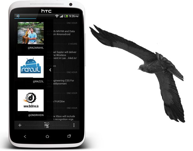
When you start the app, it has greeted you with quick splash screen. Kinda don’t like the splash screen as it slows down the app start and I want to jump immediately on the timeline. After that Signup/signing process, You’ll be reached to home activity, the interface is divided into three parts ( timeline, mentions and DM). You can switch to any activity using swiping back and forth. You’ll notice the nice animation which I have never seen before in swiping. You can also notice that during swiping header icons will pop down if you prefer to jump on any timeline by tapping on the buttons.


Like other twitter app, Carbon has ‘pull to refresh’ to refresh your timeline but wait the entire panel tilt on you. Many of you may like this animation but for me it’s distracting. The scrolling of timeline is very smooth. Another good thing about the timeline activity is that they keep it minimal, no different colors for hashtag, links, name etc. All texts are in white color.
[quote_center]Use Double Finger Swipe to jump on the Top/Bottom of the List.[/quote_center]
Carbon did Twitter for conversation pretty nicely. Tap on any individual tweet and you’ll see the replies at the bottom of the screen. You can pull the tweets up to focus on replies ( don’t forget nice card animation).


At the bottom, There is three buttons Compose (+), Profile(Pic) & Menu(three dots). The compose button allows you to compose tweet, the Profile button lets you view your profile and three dots will bring a thin menu from where you can access favorite, Lists, Trends, Search, Filters and settings.


Carbon for Twitter supports multiple account and you can switch between your account by swiping left and it’ll show up all the accounts you added with carbon.
The biggest problem with Carbon is you can’t customize the things. There is not an option to choose a photo upload service, pull refresh time, control timeline etc. For e.g. In Falcon Pro we can customize whether to load images in the Timeline or not, falcon pro allow us to load images only on Wi-Fi. Unfortunately you can’t do much with Carbon except switching off Message & Mention notification.
Carbon loads both images & video on the timeline which makes refreshing very slow especially on Data connection. I never used Carbon whenever I’m on the mobile network.
Conclusion:
The Carbon for Twitter is not for power users or who love customization. If you just want FREE Twitter client with Flashy animations then Carbon for Twitter is for you.
The app is still buggy and crashed many times and more important it doesn’t not support tablet through it will work with Nexus 7. The developer promised to release a separate version for the Tablet.
[row_box class=”left important”]
[row]
Pros
[arrow_list]
- Minimal UI
- Multiple Account Supports
- Free & Adfree
- Threaded Direct Messages
- Filters for Hashtags, Users, and Keywords
- Inline Images & Videos
- Two finger Gestures
[/arrow_list]
[/row]
[row]
Cons
[arrow_list]
- No Push Notifications
- Distracted Animation
- No Customization
- Slow refresh on Mobile network
- No tablet support
[/arrow_list]
[/row]
[/row_box]
[app]com.dotsandlines.carbon[/app]


